

Behind the SEES brand renewal – the new look, the packaging and the photography – is a group of some of Finland's most skilled creative professionals. Their craft is woven into SEES's new labels, illustrations, colours and photographs.
By the time I started planning the renewal, I had long been thinking about where Finnish happiness comes from and what it really is. I wanted to take the SEES look beyond a general Nordic feel, deeper into something genuinely Finnish. I had been studying the work of Akseli Gallen-Kallela, Albert Edelfelt, Helene Schjerfbeck and their contemporaries, and I found inspiration in the colour palettes and mysticism of the Golden Age of Finnish art.
Finland is one of the world's most respected design countries. I wanted products made in Finland, with Finnish science and innovation inside, to have the packaging they deserve, and for the look to feel of its time. For that I needed makers who understood what I was reaching for and took it further than I could have imagined myself.
Päivi Helander and Pauliina Nykänen
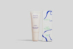
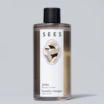
The SEES visual renewal is the joint work of graphic designers Päivi Helander and Pauliina Nykänen. The new identity draws on early 20th-century Finnish nature mysticism and its ornament, somewhere between Art Nouveau and the uncanny. Mythology blends with the shapes of nature – the blue hours of a northern summer night, when you can see an eye in a pine trunk, when twinflower winds through the moss like a path, or when sea mist softens the rocks. The packaging brings together the northern magic of Pauliina Nykänen's illustrations, a Renaissance-inspired colour world, classic book forms and Céline Hurka's soft typography rooted in early modernism.
Pauliina illustrated a label of its own for each product series.

Puttonen Ruska
The renewed products were photographed by Puttonen Ruska, a creative studio based in London and Helsinki. The studio creates bespoke campaigns and projects in beauty, design and fashion, bringing its own recognisable, story-driven approach to each one. Puttonen Ruska was responsible for both the photography and the art direction.
We shot at Hvitträsk, the studio home in Kirkkonummi built in the early 1900s by Herman Gesellius, Armas Lindgren and Eliel Saarinen. It is one of the best-known buildings of Finnish National Romanticism and dates from the very era the new look draws on.
Puttonen Ruska on the work:
The brief and SEES's new look, drawing on Finnish National Romanticism, inspired us from the start, and we were thrilled to do this shoot with such a talented team. It was wonderful to look for a fresh perspective on Finnish beauty and to create something that feels current and captivating. The vivid colours and patinated surfaces of Hvitträsk were the perfect backdrop for the renewed products, and we love how it all came together.

Susanna Vento
The Hvitträsk shoot was styled from start to finish by interior stylist Susanna Vento, who has followed SEES since its very first days. When I told her about the inspiration behind the new look, Hvitträsk was the obvious choice for her straight away. Susanna describes the place like this:
A fairytale-beautiful building whose details have offered a backdrop for a creative way of life.
Working with Susanna was a joy. The museum was closed at the time, but she always has the right numbers in her back pocket. She wanted to take the products to the source of their inspiration, and she reminded us that even at beautiful Hvitträsk, people cooked, cleaned and hosted guests. Beauty comes from small moments, and that is exactly what SEES is made for.
Päivi, Pauliina, Puttonen Ruska and Susanna, thank you. You captured an inspiration that had long lived only in my own mind. You listened, worked hard and refined every detail until each one was just right. The new SEES now looks the way it has always felt to me, and I am deeply grateful to you for that.
It is a matter of honour for SEES to highlight Finnish expertise in so many ways. Besides you, the product manufacturing, packaging design, label printing, postcards, posters, the website renewal, the product photography and many other stages were all done in Finland. The product photos were taken by Christian Jakowleff of Stilleben and styled by Päivi Helander. The portraits were taken by Sanna Lehto. Every product carries the handprint of many Finnish makers.


Elisa Koivumaa
Founder, SEES
Credits
Visual identity and packaging design: Päivi Helander and Pauliina Nykänen
Illustration: Pauliina Nykänen
Photography and art direction: Puttonen Ruska, @puttonenruska
Interior styling: Susanna Vento Oy, @susanna_vento
Location: Hvitträsk, Kirkkonummi
Product photography: Christian Jakowleff, Stilleben
Product photo styling: Päivi Helander
Portraits: Sanna Lehto